If you’ve run the right ad campaigns for the right people but aren’t getting the expected leads, it might be due to your SaaS landing page strategy.
Landing pages are an integral part of any SaaS marketing campaign, and they should be constructed well to convert into successful customer acquisition funnels. You can use them to communicate with your business’s potential customers, increase engagement among your users, and drive the growth of your business.
In this blog, you will understand how to create SaaS landing pages that are both visually appealing and actively help to enhance your SaaS performance marketing strategies.
Role of a SaaS Landing Page in Performance Marketing
A successful SaaS PPC strategy can only be implemented with a landing page that converts leads. In performance marketing, the landing page isn’t just for placeholders. This is the critical component determining whether your campaign will succeed.
Here are some statistics regarding the importance of SaaS landing pages in your marketing campaigns:
- A recent study indicates that 94% of first impressions result from design, so appearance matters.
- A well-crafted landing page can increase conversion rates by up to 300%.
- According to Forbes, it has been reported that 64% of consumers expect consistent ads across all platforms.
- Websites that use analytics are twice as likely to see an increase in revenue, according to Think with Google.
- BrightLocal says that 72% of consumers believe positive reviews increase business trust.
- In a study by QuickSprout, simplified forms on landing pages can increase conversions by 120%.
- It is crucial to ensure that your website is optimized for mobiles to provide a perfect user experience to your visitors. According to Statista, 52% of web traffic originates from mobile devices.
Now we can learn how to create the ideal SaaS landing page for your performance marketing.
Your Guide to Building a SaaS Landing Page for Your Ad Campaigns
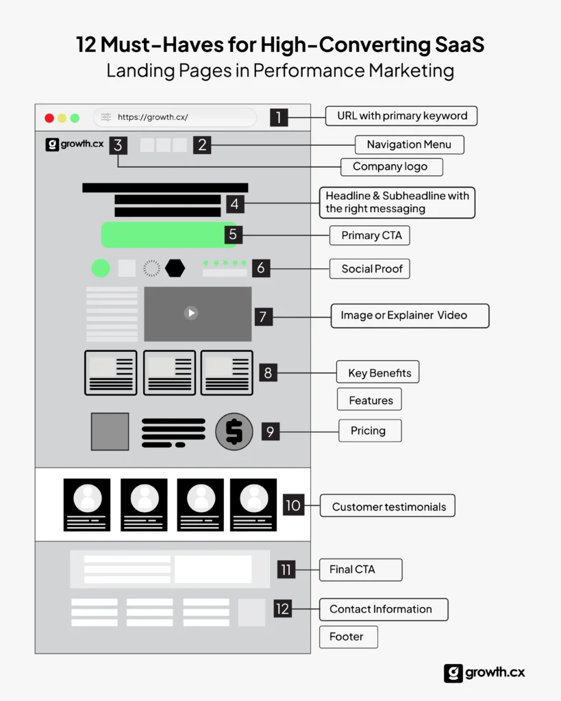
This section provides valuable insights and actionable steps to design a persuasive page that generates leads and drives business growth.
Step 1: Define Your Target Audience
To begin with, understanding your audience is crucial. Creating the perfect SaaS landing page for your ad campaign is easier when you know your audience.
There are several things to consider, such as:
- What is the purpose of this landing page?
- Who am I creating it for?
- What are my target audience’s goals, pain points, and interests?
- What part of the product or service will you visually communicate?
- What is the most important feature to highlight, whether a SaaS product or a tool?
It is beneficial to ask yourself these questions before creating a landing page to increase conversions and lead generation with your ad campaigns. Your landing page lets you present all your features and USPs to your users. You can also set up the design to cater to the needs of all your users through a better understanding of their preferences.
The better you understand your audience, the better you can set up your landing page.
Step 2: Set Clear Goals
When making a SaaS landing page for marketing, it’s crucial to have clear goals that align with industry standards. Make progress measurable by setting clear goals, such as “Increase trial sign-ups by 30% in the next quarter”.
Compare the goals of your landing page with those of your competitors to ensure you’re aligned with industry standards. For example, if your competitors offer free trials and you’re not, you might miss out on a proven strategy.
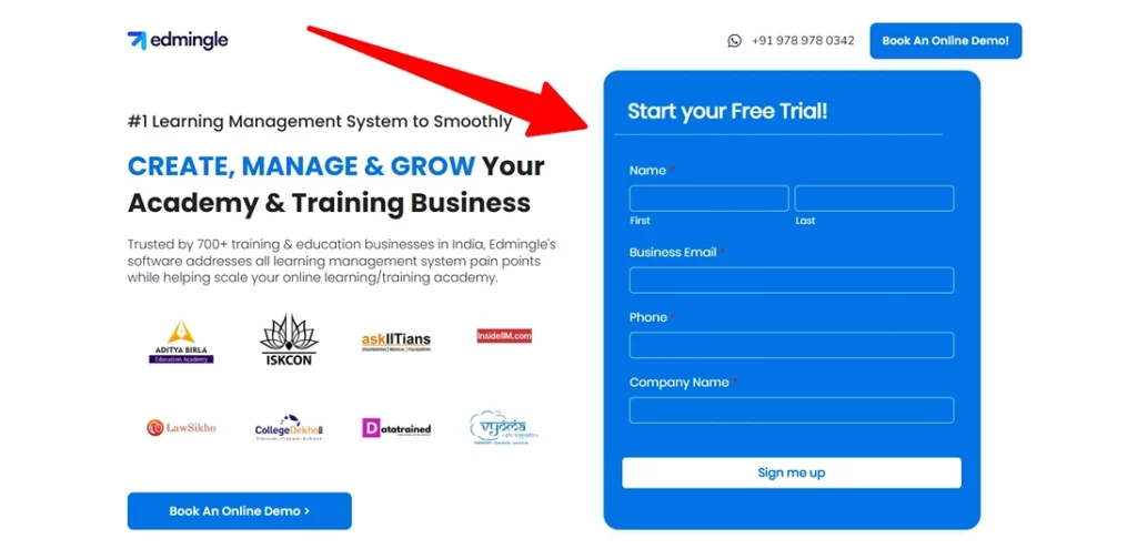
In Edmingle, the free trial is the first thing a lead sees after entering the site, so whenever a user comes in, it’ll display it in front of them so they’ll be excited to sign up.
Step 3: Competitive Analysis
Engaging in a thorough competitive analysis is a critical step in designing a successful SaaS landing page.
Here’s how to approach it effectively:
1. Examine Messaging and Design:
Are they feature-focused or benefits-driven? Look at how competitors articulate their value proposition. Notice their tone, language, and visual style.
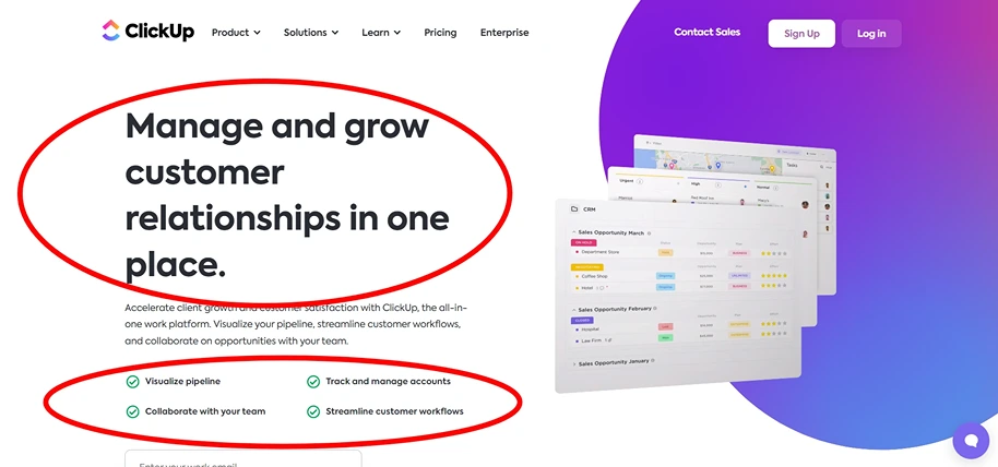
When you visit ClickUp’s page, you can’t miss their big, attention-grabbing text. They smartly list all the essential features right there on the page. Plus, signing up is fast, allowing anyone interested in those features to start.
2. Visuals Assessment
According to Adobe, content with appealing design elements can significantly enhance user engagement. Assess competitors’ use of colors, fonts, and images. Make your landing page more compelling.
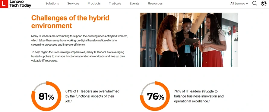
Look at Lenovo’s landing page; they skillfully incorporate orange into the fonts to emphasize crucial points, making it easy for people to notice and understand quickly.
3. Trust-Building Elements
Review customer testimonials, security badges, or case studies on your competitors’ pages. Identify areas where you can establish more vital credibility.
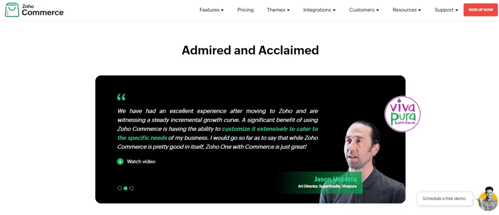
Check out Zoho’s SaaS landing page – they’ve included testimonials to reassure customers and build loyalty.
4. Analytical Tools for Insight
Utilize competitor analytics for in-depth analysis. These can reveal insights into competitors’ strategies, keywords, and traffic sources, offering valuable data for your strategy.
Tip: Use tools like SEMrush , Ahrefs , and Ubersuggest to analyze competitor landing pages. These tools can reveal much about their strategies, like their main keywords and traffic sources.
By analyzing your competitors, you gain insights that can guide you in creating a landing page that appeals to your audience and showcases your product’s unique strengths and benefits.
Step 4: Craft a Compelling Value Proposition
Your value proposition should be clear and concise.
Microsoft’s study indicates that humans, on average, have an attention span of only 8 seconds, which is shorter than that of a goldfish!
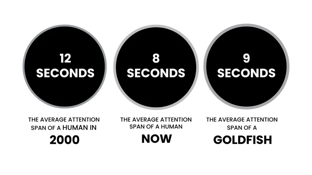
This means you need to grab attention fast. Use straightforward language that resonates with your audience and makes your offering instantly understandable. Crafting a compelling value proposition is critical in designing your SaaS landing page.
Look into this example:
It comes with clear and easily understandable language about what they offer. Additionally, they’ve placed everything you need on the landing page for easy navigation to the next step.
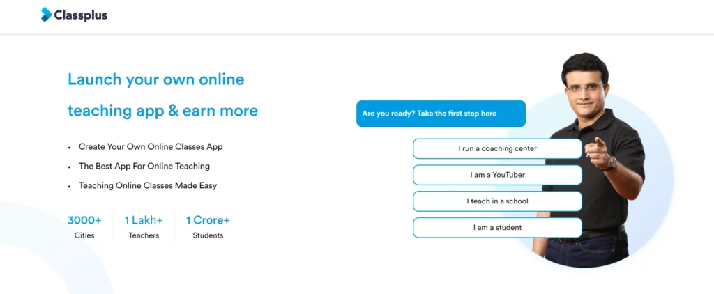
This is where you succinctly convey what makes your product unique and why it’s the ideal solution for your target audience.
Begin by using insights gleaned from your competitive analysis. This understanding helps in carving out your niche. For instance, if competitors focus heavily on pricing, you might differentiate by highlighting superior customer service or unique features.
Your value proposition is your first, and sometimes only, chance to make a compelling case for why your SaaS solution is the best choice.
Step 5: Explain the Pain Points
It’s essential to effectively address the pain points of your target audience to differentiate your SaaS product.
First, identify the common challenges your potential customers face. 42% of startups fail because they are not solving a market need. Ensure you’re addressing not just any pain point but one that is significant and relevant to your audience.
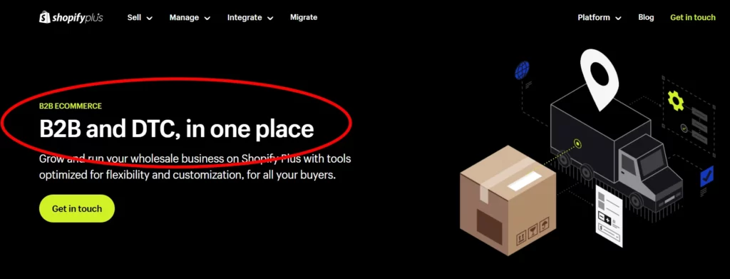
Here, Shopify is using the phrase “B2B and DTC in one place,” which means the software offers tools for both business-to-business (B2B) and direct-to-consumer (DTC) advertising, providing a comprehensive solution for managing and optimizing both types of marketing campaigns in a single platform.
So use language that resonates with your audience, making them feel understood. Remember, people are more likely to use a solution tailored to their problem. While your competitors might address a pain point, your approach to presenting a solution can make a world of difference.
Ensure you’re not just listing out pain points but also connecting them with how your product uniquely addresses them.
Step 6: Showcase the Benefits
Start by identifying benefits that address your target audience’s needs and pain points. It’s not just about what your product does but how it makes a difference in their lives or businesses.
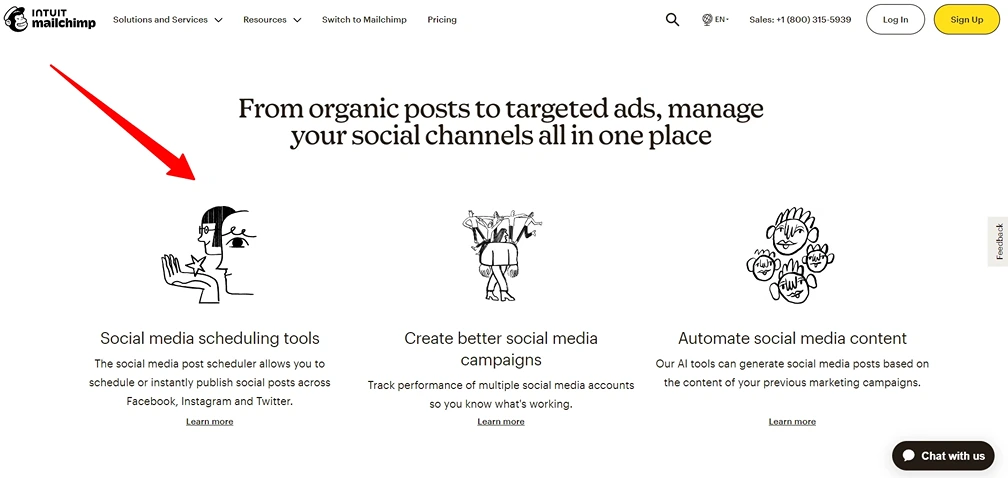
Mailchimp strategically presents the three main advantages of its product, which are designed to capture user attention effectively.
- Quantify the time-saving aspect of your software for emphasis.
- Highlight the significant benefit of customer retention if applicable.
- Focus on unique benefits not emphasized by competitors.
- Stand out in customer support or user experience if competitors prioritize functionality.
Incorporate these benefits into your landing page in a way that’s easy to understand. Use bullet points, infographics, or short video clips – formats that are quick to digest.
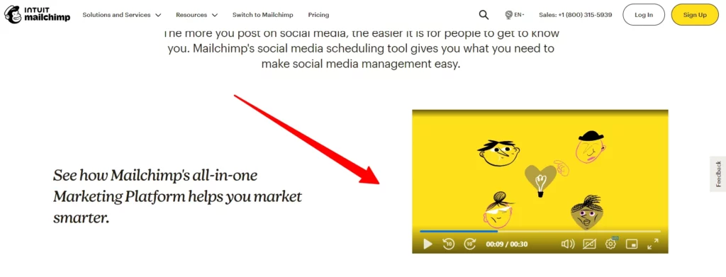
Mailchimp uses short videos with simple language for easy understanding.
Remember, the goal is to communicate the value of your product in a way that resonates with and is easily understood by your potential customers.
Step 7: Highlight Key Features
In this step, it’s not just about presenting your product’s offerings. It’s about highlighting unique features your competitors don’t have or presenting similar features more compellingly.
Just like how Trello displays its features:
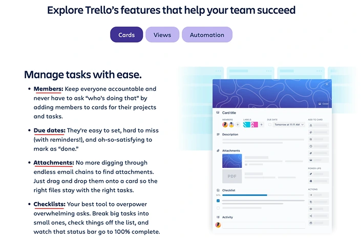
First, identify the unique features of your product. What can your software do that others can’t?
For example, if you offer a unique integration or a proprietary technology, ensure this is front and center on your landing page. So, if ease of use is a standout feature of your product, emphasize it in your SaaS landing page.
Look into Zoho CRM’s landing page, where features are thoughtfully arranged in a table for easy comprehension, which is particularly beneficial for leads. Zoho provides a clear overview and facilitates quick comparison with other CRM businesses, allowing users to make informed decisions as they meticulously detail their features.
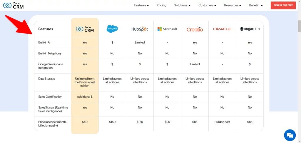
However, if your product shares many features with competitors, the challenge is to present them differently. This could mean focusing on how your features provide better value or improve user experience.
Use clear, jargon-free language so your audience can easily understand your presentation. Utilize visuals like diagrams or comparison charts to illustrate how your features stack up against the competition.
Step 8: Create a Clear Call to Action (CTA)
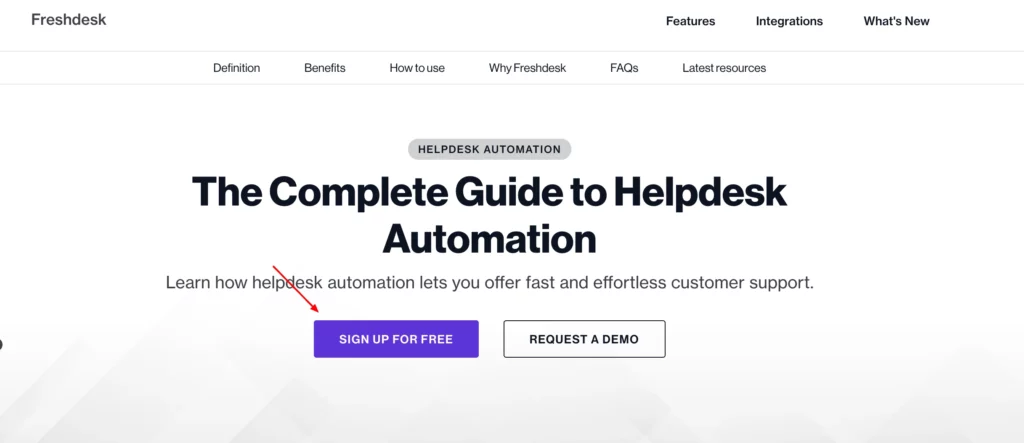
A powerful CTA is the culmination of your landing page’s content, encapsulating the essence of your offering in a compelling invitation. Your goal is to learn from their approach and then go further. A CTA that stands out is more likely to be clicked.
First, take a look at your competitors’ CTAs.
- What words are they using?
- Are their CTAs bold and prominent?
- Do they blend into the background?
The Shopify landing page has two clear calls-to-action in the middle and one in the header, which means they’re making it easy for users to engage. The dual options in the middle likely cater to different needs, while the prominent header CTA ensures quick and visible action.
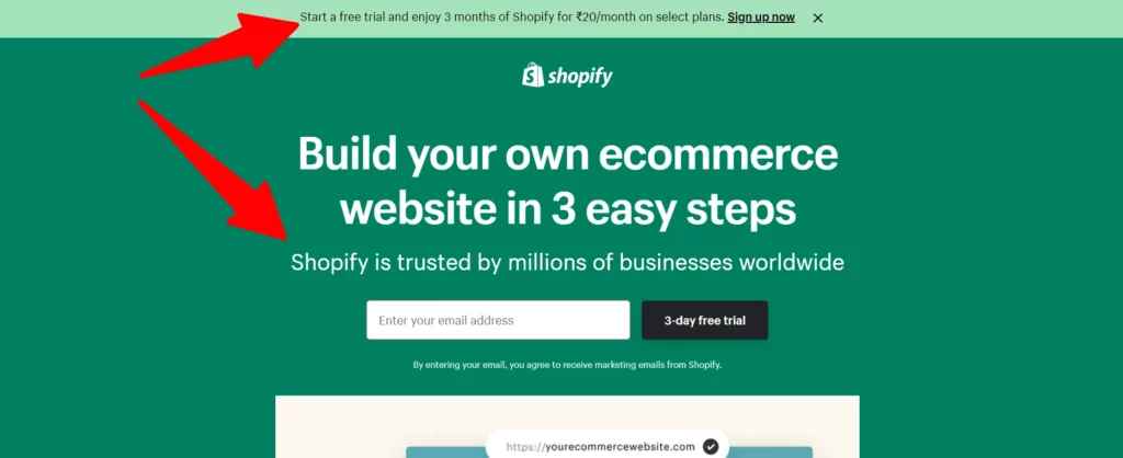
HubSpot reports that customized calls-to-action (CTAs) have a 42% higher rate of views-to-submissions than generic CTAs.This statistic underlines the importance of making your CTA clear but also relevant and personalized to your audience.
Incorporate action-oriented language and ensure the call to action is visually distinct from the rest of the page. Your CTA should encapsulate the value proposition of your offering in a concise, action-oriented manner.
Step 9: Minimal Distractions
Creating a landing page with minimal distractions is vital in guiding your audience toward your goal. In this step, we’ll focus on streamlining your landing page’s layout and navigation for maximum impact and user-friendliness.
1. Embrace Simplicity
Google’s research indicates that more straightforward websites are perceived as more beautiful. Aim for a clean, uncluttered design. Keep only essential elements that contribute to your objective.
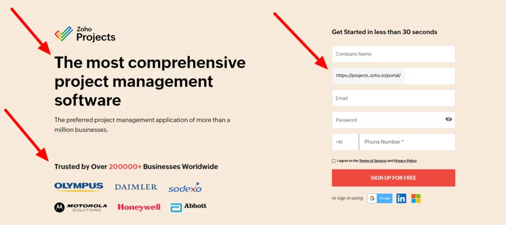
For example, Zoho’s landing page uses big headlines with short descriptions and client numbers. On the right, there’s a simple form to sign up for free. The team made it all work together while keeping things easy to understand.
2. Evaluate and Compare
When evaluating and comparing, closely examine your competitors’ pages. In learning from this, aim to create a layout for your page that is more streamlined and focused. This involves presenting information, organizing it, avoiding clutter, and ensuring easy navigation and understanding.
The goal is to offer a more user-friendly and impactful experience than competitors’ crowded pages.
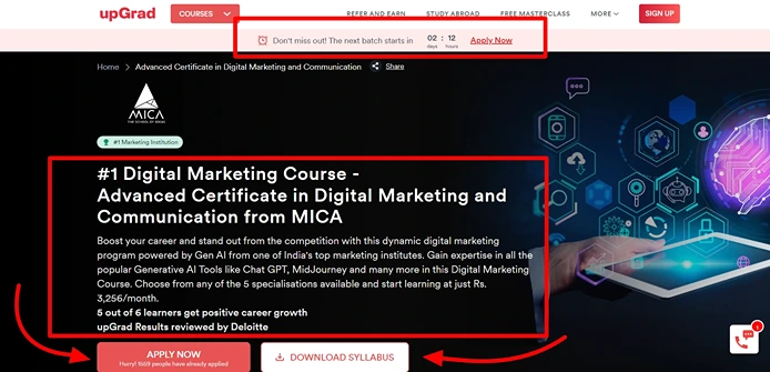
Example: In this digital marketing academy page, everything you need is right there when you come in from the ads. There’s a timer, a short description, and buttons to apply or download the syllabus. Easy!
3. Effective Use of Whitespace
Whitespace isn’t just space; it’s a crucial design element. It helps make your content more readable and draws attention to key elements like your CTA. Remember, as per Crazy Egg, good use of whitespace can improve understanding by up to 20%.
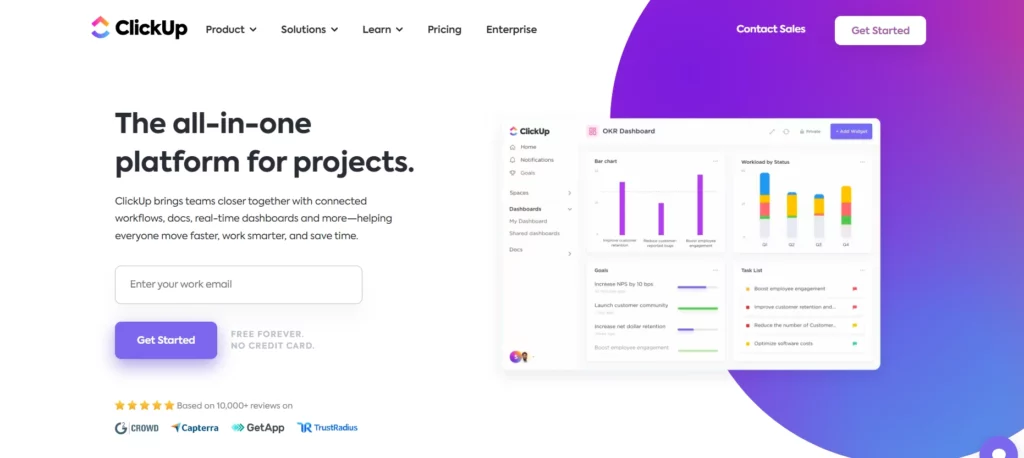
Example: Take a look at this ClickUp landing page—they made it look nice and tidy by giving it some good space around things.
4. Intuitive Navigation
Ensure that the path to your goal is clear. Remove any unnecessary links or buttons that distract the visitor from your primary action.
Focus on Key Elements:
- Make your value proposition immediately visible.
- Highlight benefits and CTAs without scrolling.
- Use visuals and text sparingly but effectively.
5. Responsive Design
Make sure your website layout is responsive and looks great on all devices, particularly mobiles, as they account for a significant proportion of web traffic.
By minimizing distractions, you enhance the user experience and increase the likelihood of your visitors taking the desired action.
Bonus Step 10: Pricing Table (Should I include pricing in a SaaS landing page?)
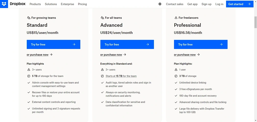
This landing page of Dropbox is notable for its clarity, as it prominently displays the pricing information.
So you have to add the pricing structure to your SaaS landing page, and here we will discuss when and when to exclude the pricing details feature.
When to Include Pricing:
- Simple Pricing Structure: If your pricing model is straightforward, showcasing it can be beneficial. Transparency in pricing, especially when competitive, builds trust.
- Competitive Advantage: If your pricing is a significant selling point, don’t hesitate to highlight it. This can set you apart from your competitors.
- Self-Serve Model: In a self-serve sales model, where customers expect to purchase without speaking to a salesperson, detailed pricing information is crucial.
- Free Trials and Freemium Models: Emphasizing free versions or trials alongside premium plan costs can entice users to start without cost and upgrade later.
When Not to Include Pricing:
- Complex Pricing Schemes: Direct users to a separate pricing page or a contact form for complex or variable pricing. This avoids overwhelming them and allows for tailored discussions.
- Targeting Enterprise Customers: For enterprise sales that require custom pricing, it’s better to focus on value and encourage direct contact for detailed discussions.
- Testing and Lead Generation: In the early stages of your product, omitting pricing can be a strategic choice to gather leads for follow-ups, encouraging users to learn more through demos or direct inquiries.
- Frequent Price Changes: If your pricing is subject to change or negotiable, omitting it can ensure clarity and avoid misinformation.
Whichever route you choose, ensure that the presentation aligns with your marketing strategy and enhances the user experience on your landing page.
Hire A Growth Marketing Professional
Building a strong SaaS landing page for your marketing campaign is challenging but essential for growing a successful business. A well-crafted website ensures a tailored experience with a consistent message, ultimately improving conversion rates.
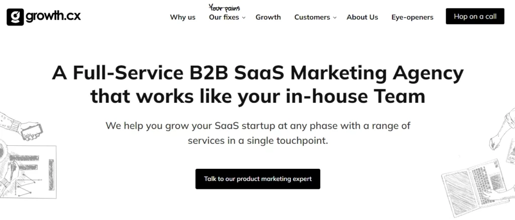
growth.cx will guide you through client research to pinpoint your target audience, create an appealing brand and website design to support your marketing campaign, and lead your company to success.
Why growth.cx Stands Out
When choosing a company to create your SaaS landing page, effectiveness is crucial to project success. Unlike most generic SaaS SEM agencies, growth.cx brings together a unique team of designers and developers who specialize in building high-converting landing pages tailored for performance-driven marketing campaigns.
Here’s what sets growth.cx apart.
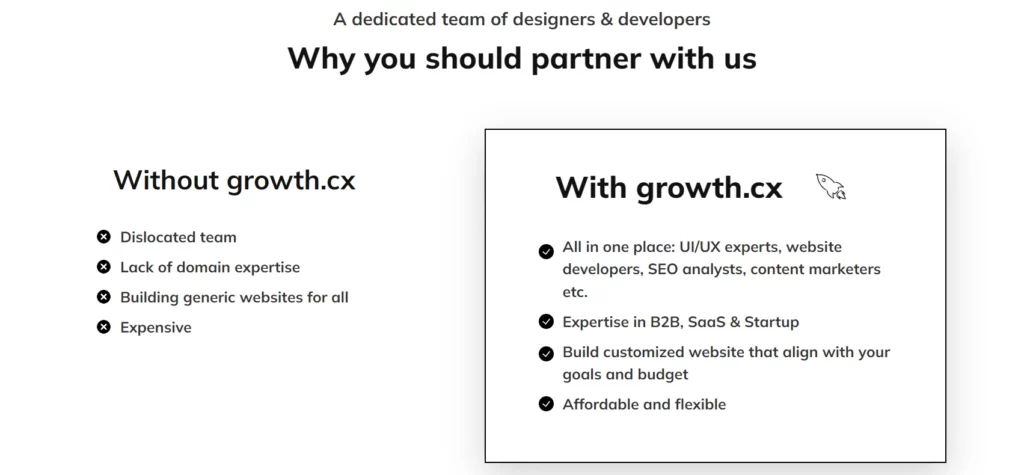
In website design, growth. cx offers a comprehensive suite of services. This includes everything from shaping the user interface and experience (UI/UX) to the full development of the website.
As a dedicated SaaS marketing agency, growth.cx provides ongoing support and maintenance, ensuring your website remains optimal. The team is skilled in migration and upgrades, guaranteeing that your site stays current and aligned with the latest technologies. Importantly, all these services are executed precisely using the right frameworks, resulting in an exceptional and highly functional website.
Conclusion
In wrapping up, creating a top-notch SaaS landing page is key to successful ad campaigns.
It’s the gateway to capturing leads and boosting conversions. Whether you’re a professional or just starting, this complete guide provides insights and steps to help you craft a compelling landing page. Understand your audience, set clear goals, analyze competitors, and focus on a solid value proposition.
Also, consider contacting a web design and development agency to craft a perfect SaaS landing page for your ad campaigns. It simplifies the process and ensures an effective online presence for your advertising efforts.
Also Read: Best Examples of SaaS Marketing Campaigns and Outcomes
FAQS
How do I create a SaaS landing page?
Create a SaaS landing page by defining your audience, highlighting benefits, using visuals, implementing a clear CTA, optimizing for mobile, incorporating a lead form, and refining through testing.
What is in a landing page?
A landing page includes a compelling headline, visuals, a clear CTA, a lead capture form, feature highlights, testimonials, trust indicators, minimal navigation, footer links, and responsive design.
